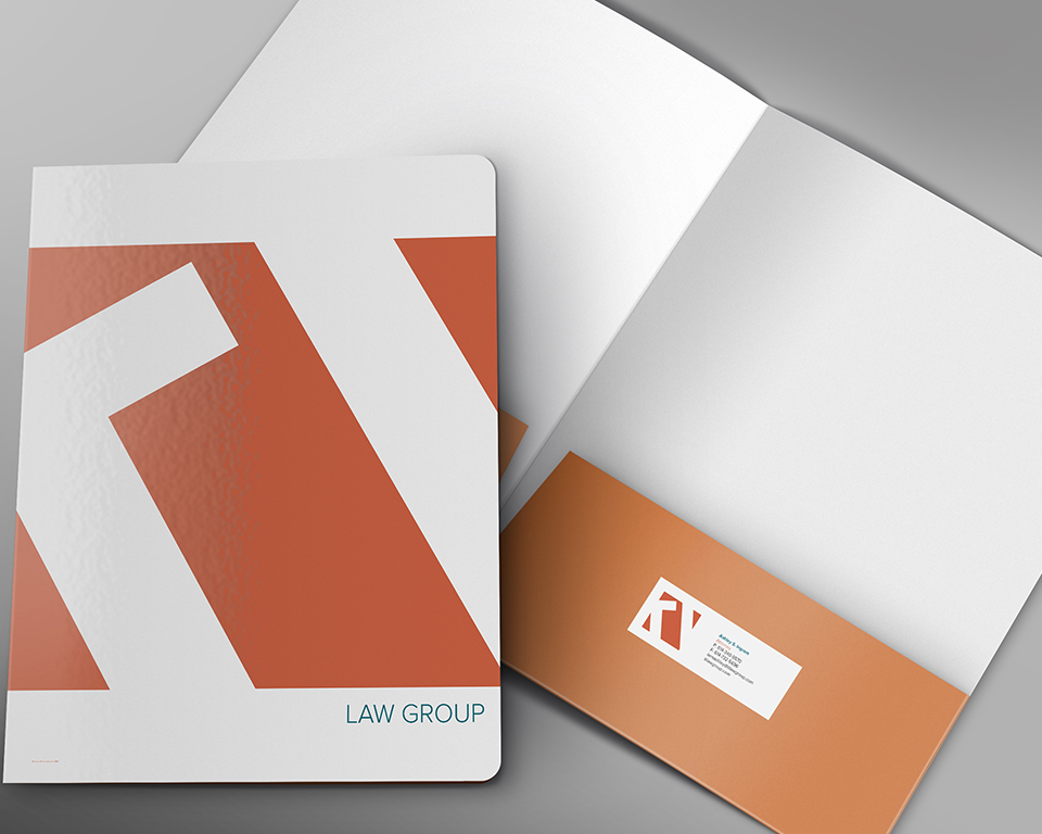
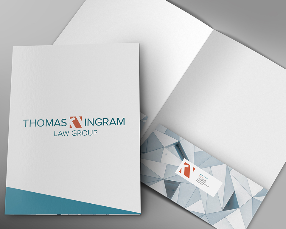
I was contracted by the Thomas Ingram Law group to create new branding and print collaterals. Thomas Ingram is a legal services firm providing experienced counsel and creative solutions to individuals & businesses.
My client wanted to stay away from the traditional aesthetic of law firm logos.
My goal was to create balance with the new branding. Taking a queue from the mission statement I wanted to provide a brand that is creative but is still professional and representational of the legal profession.

Icon
Strong enough to stand alone but also brings balance when combined with the wordmark. This icon is the primary mark of the logo. A minimalistic approach was utilizing as to create the initials within the negative space.

Color Palette
Bold but warm palette. Utilizing the orange and the primary color for the icon and the teal for the typeface.